
Project Type: Self-initiated concept for a real business
Timeline: 4-6 weeks
Role: UX/UI Designer, Branding, Visual Design
Tools: Figma, FigJam, Adobe Illustrator, Adobe Photoshop
Project Overview
As a regular shopper at Labels Resale Boutique, I saw an opportunity to improve the experience for both shoppers and consignors. While I’ve always appreciated the unique finds and curated selection, I noticed firsthand that the website felt outdated, the search experience was clunky, and policies were hard to find and interpret. This inspired me to take on a self-initiated redesign focused on elevating usability, transparency, and trust.
I reimagined Labels Resale Boutique’s digital presence with a user-centered approach—redesigning the website for clarity and accessibility, and designing a brand-new mobile app to bring the experience to users on the go. From streamlined user flows to a refreshed brand system, this concept bridges style with usability to support both consignors and shoppers.
Deliverables:
Mobile App Design
Responsive Website Redesign
Logo & Brand System Redesign

The Problem
Labels Resale Boutique offers a unique and curated secondhand shopping experience—but its digital touchpoints fall short of supporting and engaging its core users, especially consignors.
Through public reviews, user comments, and my own experience as a regular shopper, I identified the following core issues:
Low Trust and Transparency for Consignors
No Digital System for Tracking Items
Outdated, Cluttered Website UI
Inconsistent Brand Identity
No Mobile App


Inconsistent Brand Identity
Goals & Success Metrics (Hypothetical)
While this was a self-initiated concept, my design solutions were guided by measurable goals that could directly benefit both users and the business.

Competitive Research
To better understand the resale and consignment landscape, I analyzed a range of platforms—from luxury resale marketplaces to local consignment stores with an online presence. This research helped me identify design patterns, pain points, and opportunities that could differentiate Labels Resale Boutique while staying aligned with user expectations.
Platforms Analyzed:
The RealReal – Luxury consignment marketplace
ThredUp – Modern, mass-market consignment experience
Poshmark – Peer-to-peer selling with strong community features
2nd Street – In-store resale with a digital presence
Depop – Gen Z resale marketplace focused on visuals and trends

Key Insights:
Mobile-first design is standard among leading platforms (RealReal, Poshmark, Depop), with intuitive filtering and product discovery.
Most competitors have a visual, user-friendly “How It Works” page that breaks down the consignment process.
Platforms like The RealReal and ThredUP offer transparency for sellers, showing item status and payout updates.

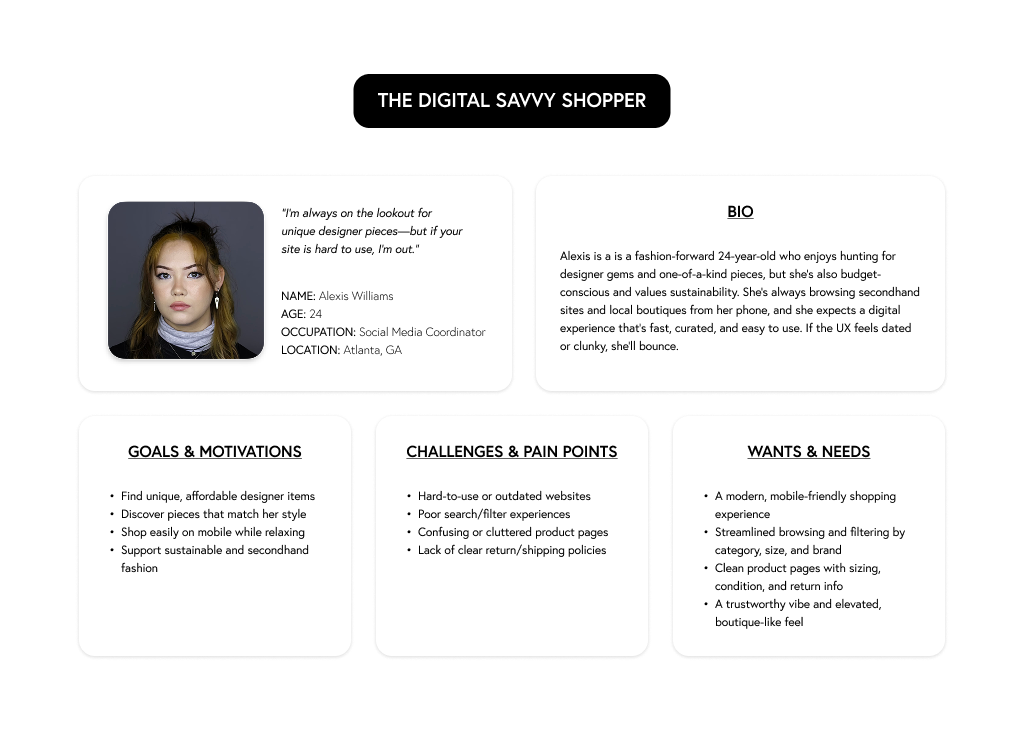
User Personas
Using insights from both personal experience and online feedback, I developed two core user personas: one for consignors and one for shoppers.

User Flows
To ensure a smooth and intuitive experience for both shoppers and consignors, I mapped out key user flows that addressed the most important tasks and pain points identified in my research.
Shopper Flow: Discover → Purchase
The shopper experience focused on ease of browsing, product discovery, and checkout. These flows were designed to mirror modern e-commerce expectations while highlighting Labels’ curated inventory.

Shopper Flow
Consignor Flow: Learn → Submit → Track
The consignor experience prioritized building trust, offering transparency, and digitizing outdated processes like paper forms and manual tracking.

Consignor Flow
Information Architecture
To rebuild the website’s information architecture, I began by referencing competitor sites to understand how leading resale platforms structure their navigation and surface key content. I focused on cleaning up the cluttered navigation by reorganizing product categories and prioritizing the most-used filters for easier browsing.

Web Sitemap
Ideation & Wireframes
I began the ideation phase by mapping out core user tasks based on research insights and usability pain points—balancing the needs of both shoppers and consignors. I prioritized flows that addressed clarity, efficiency, and transparency, and explored multiple layout directions through hand sketched wireframes before moving onto digital wireframes.
Hand Sketching → Digital Wireframes

Mobile App Wireframes
For the mobile app, I focused on two key flows:
1. Shopper Flow:
Browsing, filtering, and checking out—designed for ease and speed on smaller screens.

Shopper Flow: Browse → Checkout
2. Consignor Flow:
A dedicated “Sell” tab that includes an accessible “How It Works” section, a digital consignment form to replace manual in-store paperwork, and a sales dashboard where users can track their listed items, sold pieces, and payouts. This addressed the trust gap and modernized operations.

Consignor Flow: Submit Consignment Form → Track Items
Responsive Website Wireframes
For the website, I designed wireframes across desktop, tablet, and mobile to support a consistent, frictionless experience at every screen size. Key updates included:
Simplified Navigation: Reorganized categories and filters for easier browsing.
Improved Product Page: Clear hierarchy, better visuals, and concise descriptions to aid decision-making.
Consolidated Consignment Page: Replaced dense policy text with a step-by-step, image-supported “Consign With Us” page to build clarity and trust.
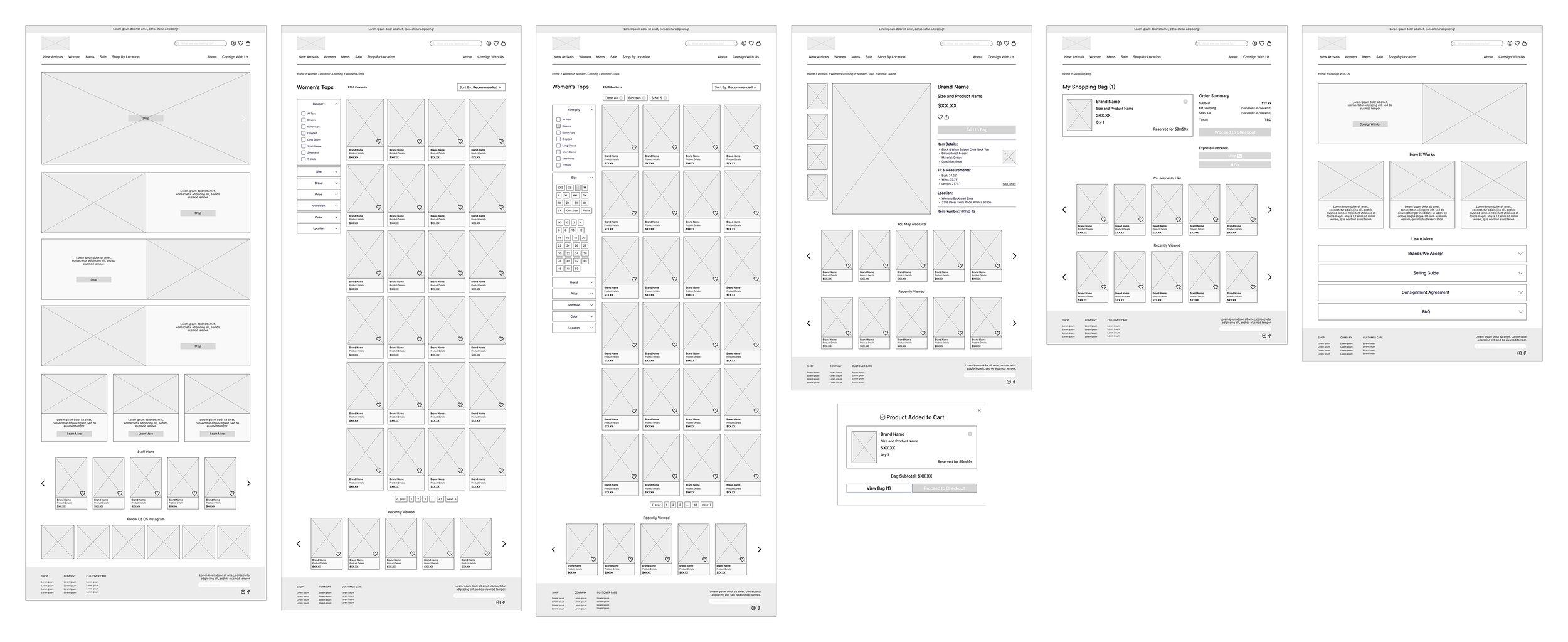
Desktop Wireframes

Usability Testing
To validate the app’s core flows before moving into high-fidelity design, I conducted usability testing with the low-fidelity prototype. Five participants were asked to complete six key tasks, covering both shopper and seller journeys.
Tasks:
Browse for a woman’s cropped top → Tested category visibility and navigation clarity
View product details → Evaluated layout comprehension and content clarity
Add to bag & complete checkout → Assessed flow intuitiveness and user confidence
Navigate to the “Sell” tab & review consignment info → Checked for content clarity and user trust before consignment
Complete the digital consignment form → Observed ease of input, form flow, and field clarity
Locate and review the “Sales” dashboard → Measured success in tracking consigned items and payout visibility

Remote User Testing Screen Recordings
Key Insights:
Shopping Flow:
Users found browsing and checkout intuitive, but requested additional size references (e.g. size chart or model photos) and clearer visual feedback when adding items to the cart.Consignment Form:
Some users found the form fill layout confusing at first glance. I adjusted the spacing, hierarchy, and section labels to improve clarity and reduce cognitive load.Sales Dashboard:
Users appreciated the ability to track consigned items. Several suggested enhancing it with a more visual overview—like total earnings and item status summaries.

Branding & UI
After refining the structure and content, I moved into high-fidelity UI design and a full brand refresh to modernize Labels’ digital presence while honoring its vintage charm.
Key Updates:
Logo Redesign: Elevated the original 1950s-inspired script into a bolder, more legible mark—preserving retro charm while improving digital readability.
Color Palette: Maintained the primary blue color (but more muted) and introduced warm neutrals to evoke a timeless, boutique feel.
Typography: Combined serif with sans-serif for a balance of style and clarity.
Visual Language: Developed a cohesive system of UI components, icons, and layouts to unify the experience across mobile and web.
Imagery Direction: Featured professional product photos on mannequins to convey fit and aid browsing. Retained original “staff-modeled” imagery to preserve the brand’s local, personable identity.
This revamped brand system creates a strong visual foundation that communicates trust, style, and consistency—setting Labels up for growth across new digital touchpoints.


Mobile App UI Sticker Sheet
Hi-Fidelity Prototype
After testing and refining core user flows, I translated the structure and insights into a polished, high-fidelity prototype. The UI balances boutique charm with modern usability—featuring clean layouts, scannable content, and intuitive interactions across both mobile and web. From product browsing to consignor dashboards, each screen was designed to feel trustworthy, stylish, and seamless across touchpoints.
Mobile App Mockups

Shopper Flow

Consignor Flow
Tracking Flow
Website Mockups

Reflection & Learnings
This project gave me the opportunity to combine branding, UI design, and UX strategy in a way that closely mirrors real-world product challenges. Since it was self-initiated, I had to define the problem space, drive the creative direction, and think critically about both user needs and business goals.
Key Takeaways
Empathy fuels better design. Reviewing customer reviews helped me see beyond surface-level issues and dig into the emotional frustration consignors were experiencing. That shaped the tone, functionality, and structure of both the website and app.
A unified brand builds trust. Through redesigning the logo and identity system, I saw how visual consistency plays a huge role in perceived professionalism and user confidence—especially in a resale marketplace where authenticity is everything.
Mobile-first thinking is essential. Designing the app helped me think through how different user types interact with a product depending on context (on-the-go sellers vs. leisurely shoppers), and how streamlined flows can solve big communication gaps.
What I’d Do Next:
Conduct usability testing on the hi-fi prototypes with regular consignors and shoppers of the boutique
Collaborate with a developer to understand potential implementation constraints
Explore personalized features like item wishlists or notifications for price drops